Wingback E-Commerce (Start-up) - UX/UI -Conversion Rate Optimisation Website Redesign

Challenges
No conversion rate optimisation process
Multiple data systems collecting contradictory data
Fast passed start-up environment with limited resources
Shopify theme CMS restrictions
Overview
Wingback had made a financial investment to drive visitors to their website, but they realised these visitors were not converting into paying customers. As a result, Wingback was experiencing stagnant revenue growth. As the sole and Lead UX Designer I owned and led the UX project strategy process of uncovering hurdles blocking customer purchases on the Wingback website and designed solutions to convert more visitors into paying customers while providing them with a great customer experience.
Outcomes
Increased conversion rate
Increased average purchase value per order
Increased repeat customer rate
Duration
4 months / one quarter increased conversion rate
Stakeholder Interview
I held a remote meeting with the CEO and CFO of Wingback to gain an understanding of the work that had been done around user touchpoints that could affect the website redesign. I also wanted to understand their brand. They informed me they were undergoing a complete rebrand, which presented a good opportunity to revisit the website's conversion. I outlined a project strategy and provided them with a timeline for the project's completion.
Data Review
After the meeting, I was given access to the quantitative data on Wingback's current website so I could investigate where users were dropping off or spending too much time. This gave me insight into the areas creating pain points for customers. Wingback was collecting conflicting data using both Google Analytics and Shopify. After discussing the product promotion cycle with the stakeholders and seeking data points that reflected the promotions, I determined that the Shopify data was the only source mapped correctly to the website.
From the Shopify data, I identified that the two biggest drop-off points were the home screen, where most customers started their journey and the product pages. This gave me clear areas to focus on. The data also revealed that most visitors were continuing their journeys from the home page via the 'All Stationery' page, as it was the first option in the top navigation.
The data review also allowed me to define key success metrics, which I would focus on:
Increased visitors reaching the product page
Increased visitors reaching the basket
Increased conversion rate
Increased average purchase value per order
Increased repeat customer rate


Information Architecture Review
With the data highlighting the importance of the top navigation for product discovery and potential conversion, I turned my attention to the top navigation. I reviewed the information architecture and realised that it had grown organically without much strategic thought, creating confusing user flows, dead-end journeys and no future-proofing as the website grew.

Prototype
With the screen flows in place, I was ready to create an interactive prototype and conduct user testing with Wingback customers.
User Testing
I recruited participants, wrote the topic guide, and user-tested the mobile prototype with 4 Wingback visitors and 4 past customers. The user test showed that I had succeeded in informing participants about the types of products Wingback sold. However, some participants suggested adding an explanation of the product categories. I incorporated this feedback, along with other insights, into the next iteration.
Design system
As I created the higher fidelity UI design for both mobile and desktop I kept separate files for documenting the components. I shared the file with the developer. The purpose of the design system was to future-proof the website making it constant and ensuring fast iterations, updates and releases.

UI Design
I made sure I incorporated all of the findings I discovered from the user testing sessions into the UI designs I created for mobile and desktop.

Wingback Navigation UI
Desktop UI

Wingback Home screen UI

Wingback Navigation UI

Wingback Home screen UI


Images from Design system
Developer Handover
With the UI designs completed, I handed over the design system file along with the final UI files. I worked closely with the engineer to ensure the design was implemented as intended. I also assisted with any questions or challenges that arose during the build process. One challenge was the level 2 navigation structure which was also the top navigation was too large for the CMS rules of the Shopify theme. As a solution, I redesigned the navigation to a more minimal version with only two items (Shop and Services) which housed all of the Wingback pages.
Outcome
Visitors reaching the product page: +45%
Visitors reaching the basket: +30%
Conversion rate increase: +22%
Average purchase value per order increase: +13%
Repeat customer rate increase: +20%

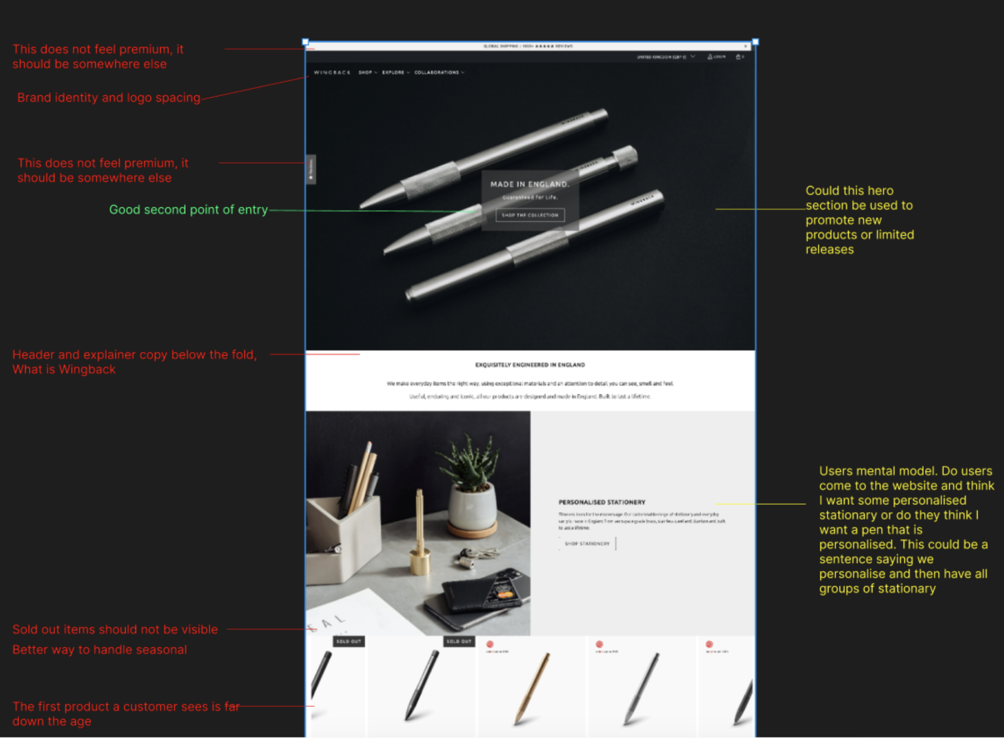
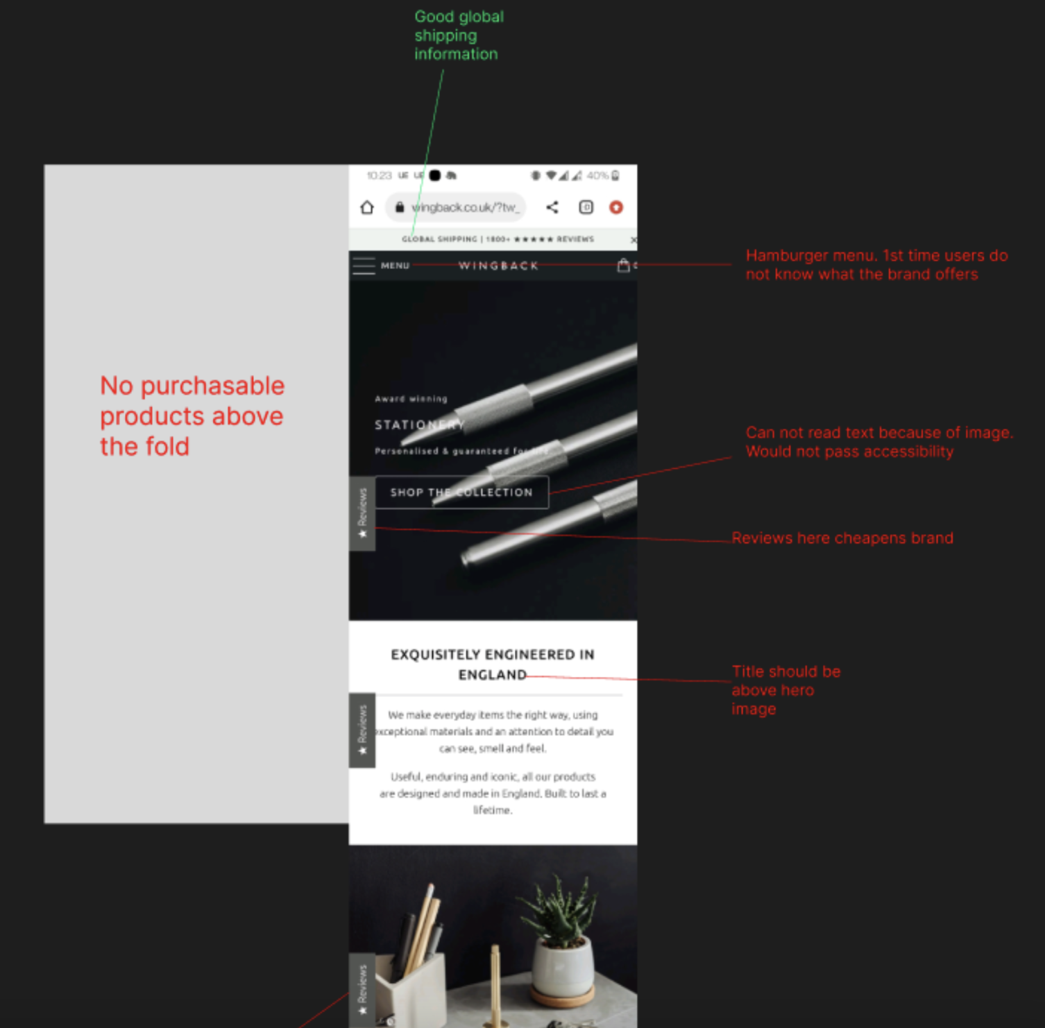
Website UX Review
To gain further insight into how the pages were structured and where the dead-end journeys occurred, I conducted a UX review particularly focusing on the home screen and the product pages. I uncovered some significant issues that could have been preventing visitors from gaining the confidence to convert. For new customers landing on the home screen, it wasn’t clear what Wingback did. Additionally, many sold-out items were displayed on the home screen, giving the impression that most products were out of stock, which could deter customers from exploring further. Furthermore, products were placed too far down the homepage, requiring users to scroll significantly before finding something to purchase.
Customer Survey
To complete the picture of the pain points, I wrote and sent a survey to previous Wingback visitors and customers. This provided me with qualitative data and allowed me to understand first-hand why customers weren’t converting. One key finding was that customers didn’t feel informed enough to confidently make a purchase. This validated the quantitive data reflecting the second biggest drop-off point being the product page.

Competitor Analysis
After identifying the pain points, I conducted a competitor analysis to see how other mid-to-high-end e-commerce companies addressed similar issues. Brands I examined included Monica Vinader, Dunhill, and Stutterheim. One element I appreciated from Stutterheim was their use of buttons above the fold, directing customers to different product sections. This quickly informed customers of the product types and allowed them to start shopping immediately.

New Information Architecture
To inform customers landing on the home screen about Wingback’s offerings, I designed a new level 2 navigation structure mega-menu, using the top navigation as a way to quickly communicate and explore the products Wingback sold.

Create a feature and functionality list
I held a meeting with the CEO and CFO to present my findings. They were pleased with the direction of the project, and together we created a feature and functionality list aimed at resolving user pain points and instilling confidence in Wingback. I then explored Shopify themes to find one that allowed us to build most features out-of-the-box with minimal custom coding within its CMS.

Wireframes
After agreeing on the features and functionality with the CEO and CFO, I created mobile and desktop wireframes to address the user pain points I had discovered. These wireframes represented an initial idea of where different elements would be placed.


Screen flows
I then created screen flows to ensure the designs of the interactive elements were in the right place to allow the user to move from one page to another.